Singularity
Brand Identity, Motion Graphics, Social Media, & Dynamic Monogram
for Strategic Branding Agency
SINGULARITY.
With the studio being named after the center of a black hole where space and time are infinitely distorted, exploring the uniqueness of this mysterious space phenomenon is at the core of this brand’s identity.
The Center
of the Brand
With only one photograph ever documented of a black hole, researching the appearance of one provided an exciting challenge. We were, however, able to gather considerable information based on written research and computer generated renders.

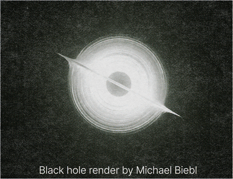

“This particular angle of a black hole was selected primarily because it subtly hints at an ‘S’ form.”
WARNING
•
FLASHING LIGHTS
•
CLICK TO SCROLL PAST
•
WARNING • FLASHING LIGHTS • CLICK TO SCROLL PAST •
Space & Time
We selected one view to be the primary logo and the rest were kept as additional illustrations to be used over time in our print and digital spaces. This particular angle of a black hole was selected primarily because it subtly hints at an ‘S’ form.
The appearance of a black hole changes based on which angle you are looking at it. I thought that instead of selecting amongst the most commonly seen depictions, we’d instead focus on expressing the variability in its form.
“We created a detailed system of logos based on exact pixel sizes”
The Monogram
The monogram was first hand-drawn on grid paper to ensure mathematical precision was present where it was needed. I then recreated the logo in vector form with every curve and spacing being based in mathematical or optical truths.
From there, we created a detailed system of logos based on exact pixel sizes so that the line weight and spacing remained consistent between various sizing applications.
Vector Celestials
I expanded the design language of the logo into a set of 100+ celestials made entirely of line segments. Each graphic can be easily manipulated non-destructively to create essentially infinite iterations.
The graphics were created to allow for expressive application of our brand at minimal print costs for internal documents.