
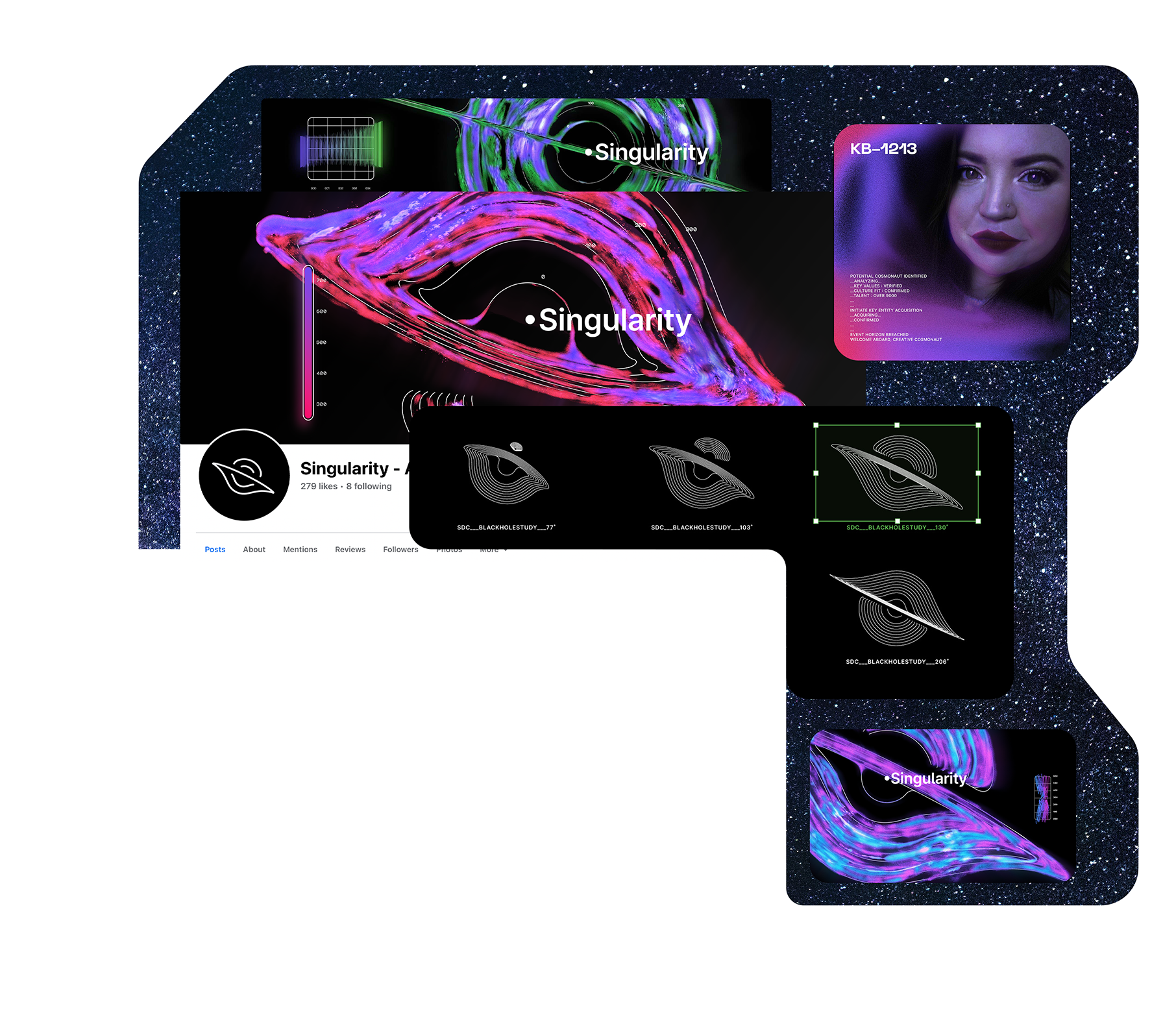
Brand identity, adaptive logo design, motion graphics, and illustration for a strategic branding agency based in Findlay, OH
With the studio being named after the center of a black hole, exploring the uniqueness of this mysterious space phenomenon is at the core of this identity.


SydneyInTheory
Album Rollout, Album Artwork,
Single Artwork, Instagram Promo
for SYDNEYINTHEORY
Combining the physical attributes of the human body and a computer, the cover visualizes the moment right before finally reaching "the light." Someone is reaching out to this light, surrounded by dust, grime and smudges on a screen suggesting a galactic explosion amongst a sea of stars. The artwork captures the cosmic existentialism buried within the fabric of the sounds contained within the music.
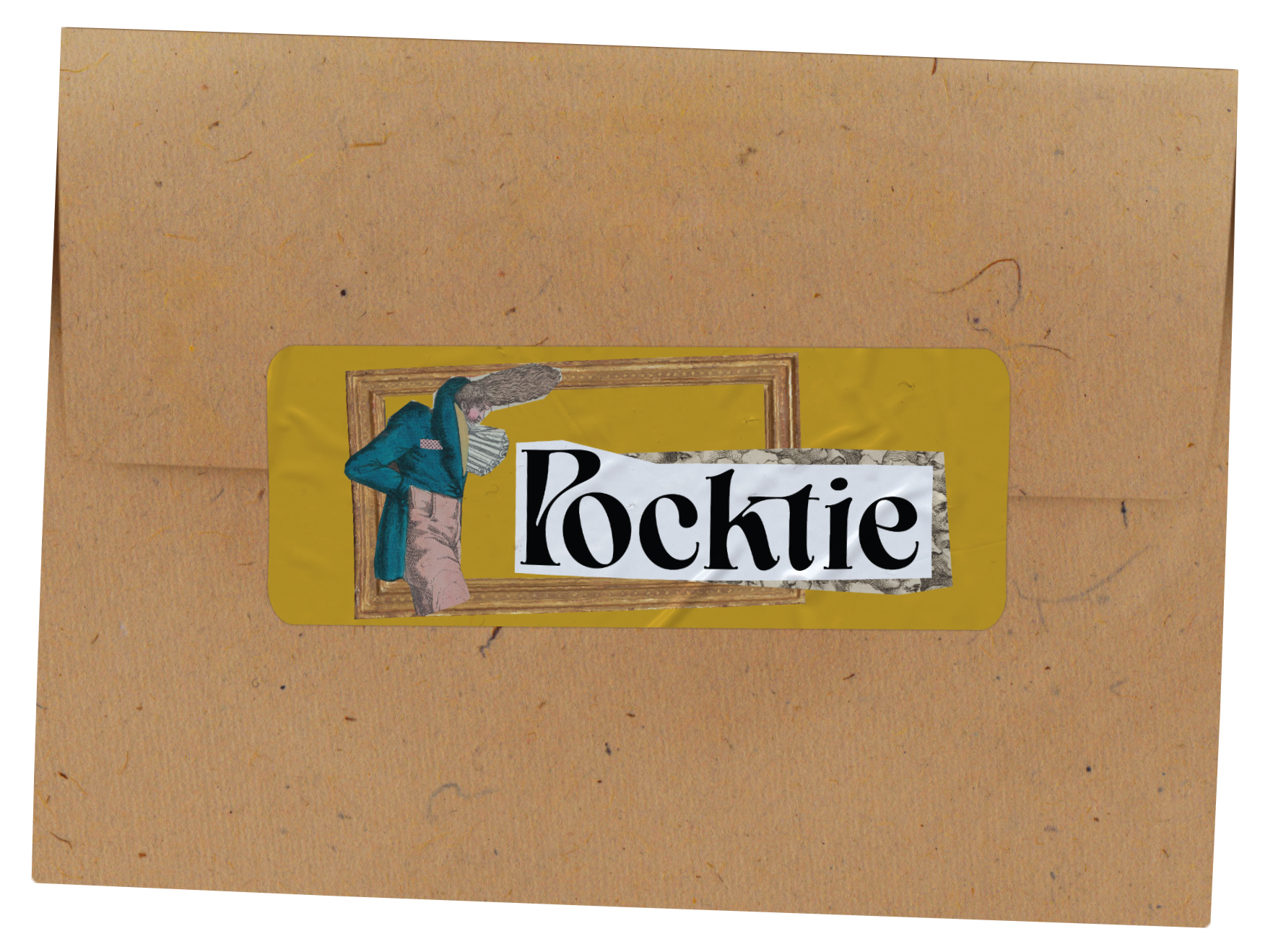
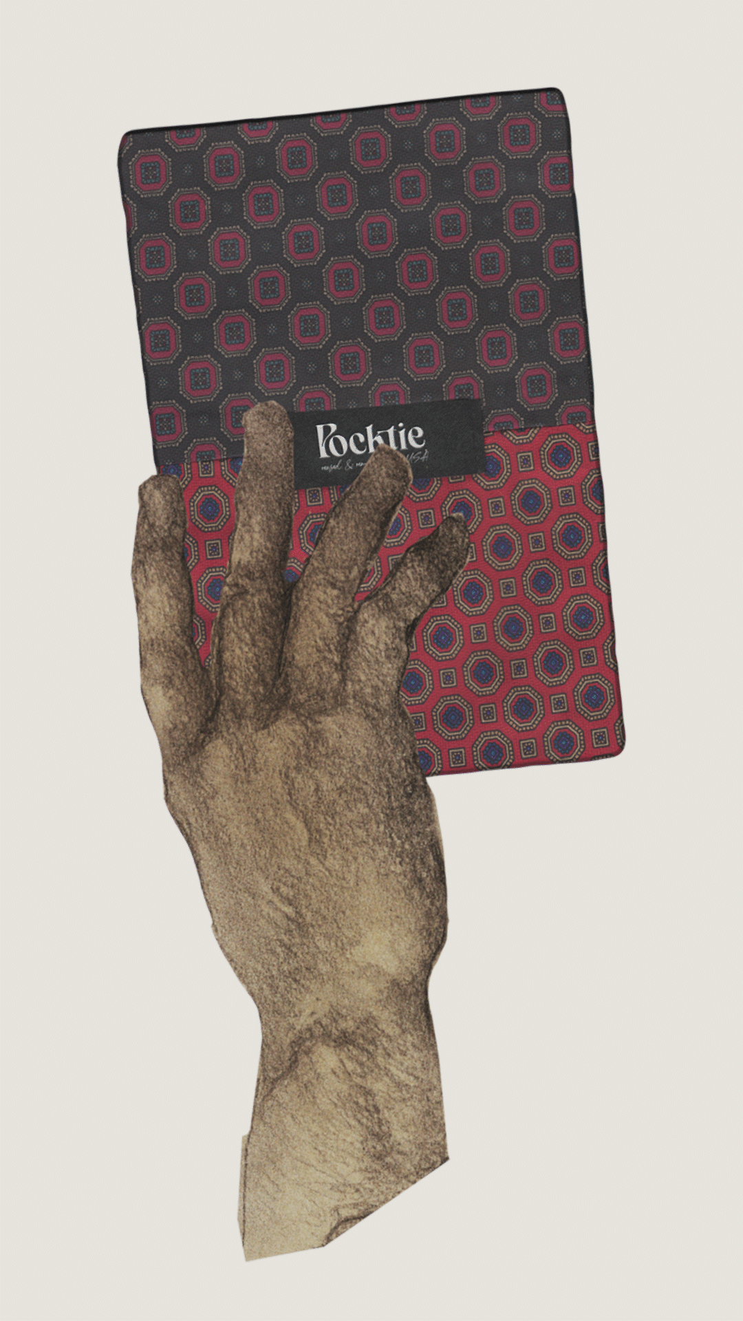
Pocktie
Brand Identity, Custom Lettering, Social Media, & Website Design
for Sustainable Pocket Square Brand POCKTIE.
As business becomes more casual there is an opportunity for men’s fashion to once more be expressive. Pocktie seeks the bold and exciting from the best eras of mens fashion to craft one of kind, sustainable pocket squares to spice up your everyday work-wear. With the purchase of only 1 Pocktie, you’ll be able to wear a new style nearly every weekday as each product comes with 4 different patterns.
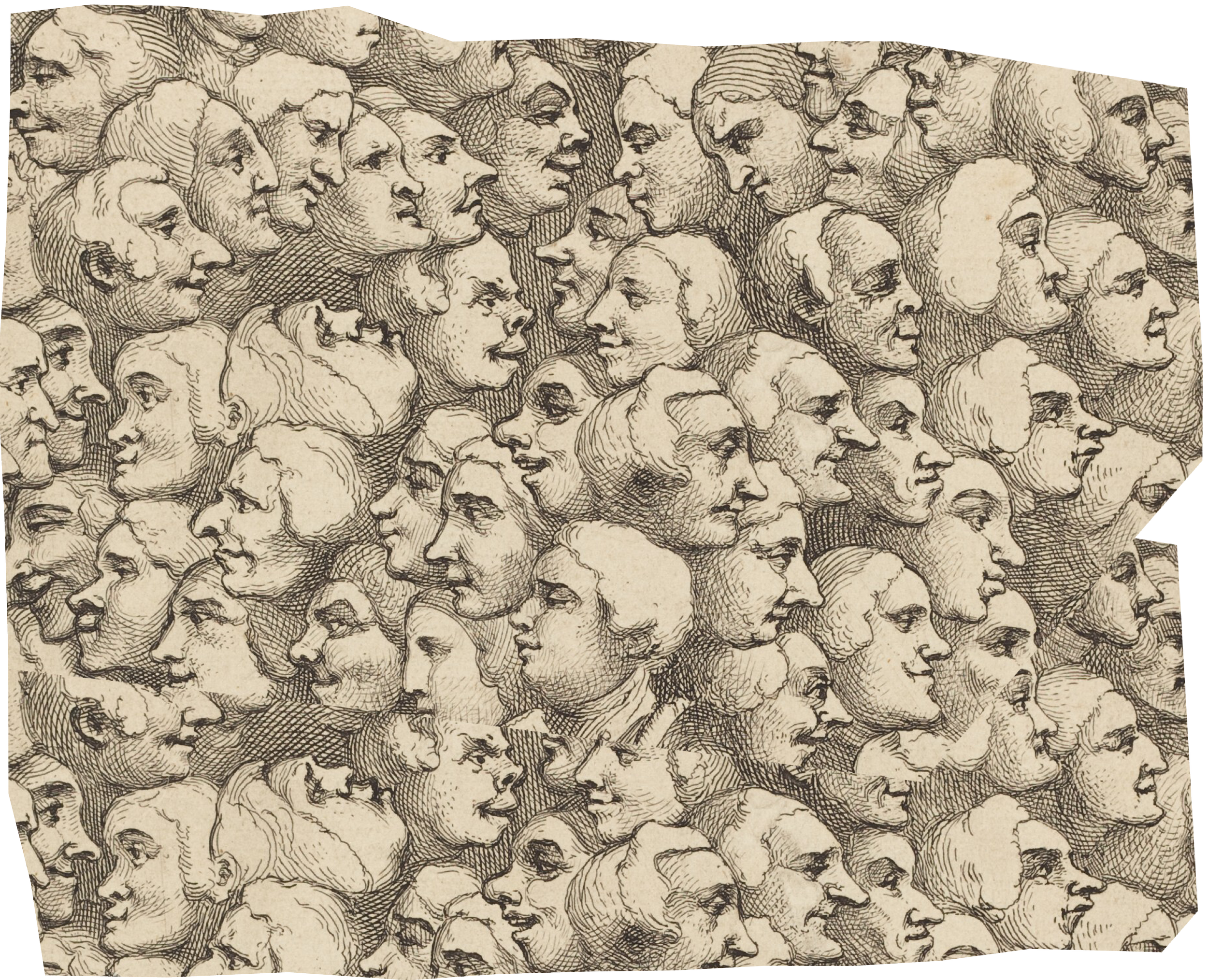
Custom Lettering for Pocktie
When Nicholas Hall of Pocktie approached us with the products he’d made, it was clear the wordmark for the brand had to represent the product’s best attributes; its playful whimsy & its distinguished charm.
Inspired by vintage satire we found in public domain archives, the Pocktie wordmark feels like a warm hand shake from your favorite uncle.
Learn about the full project here.
PACKAGING
PACKAGING
PACKAGING
SINGLE ARTWORK
BRAND ASSETS
BRAND ASSETS
BRAND ASSETS
VECTOR CELESTIALS
BRAND ASSETS
BRAND ASSETS
BRAND ASSETS
Space & Time
Just like the products themselves, the visual language breaths new life into recycled materials. We twisted and contorted patterns found in the various Pocktie and paired them with carefully selected vintage printed satire from the public domain. This gives the brand identity a consistently unique digital presence.
We packaged each product in envelopes made with recycled paper allowing for an economic and environmentally friendly alternative to complicated packaging. Each one of these consumer touch-points help to communicate the sophisticated quirk of Pocktie.
Sustainability Squared
Just like the products themselves, the visual language breaths new life into recycled materials. We twisted and contorted patterns found in the various Pocktie and paired them with carefully selected vintage printed satire from the public domain. This gives the brand identity a consistently unique digital presence.
We packaged each product in envelopes made with recycled paper allowing for an economic and environmentally friendly alternative to complicated packaging. Each one of these consumer touch-points help to communicate the sophisticated quirk of Pocktie.
Combining the physical attributes of the human body and a computer, the cover visualizes the moment right before finally reaching "the light." His hand reaching out to this light, surrounded by dust, grime and smudges on a screen suggesting a galactic explosion amongst a sea of stars. The artwork captures the cosmic existentialism buried within the fabric of the sounds contained within the music.
Sustainability Squared
Just like the products themselves, the visual language breaths new life into recycled materials. We twisted and contorted patterns found in the various Pocktie and paired them with carefully
Just like the products themselves, the visual language breaths new life into recycled materials. We twisted and contorted patterns found in the various Pocktie and paired them with carefully
Just like the products themselves, the visual language breaths new life into recycled materials. We twisted and contorted patterns found in the various Pocktie and paired them with carefully
"I believe that my musical form is a vessel intercepting transient cosmic messages from celestial beings. The idea is underground so imagine a grungy space where I'm tapping at keyboards and old computers trying to receive all the messages being able to tap into
this source but also having this existential crisis about what it means to be alive. It's about being human and questioning all those experiences; an homage to our growth in the human experience." - Sydney In Theory
“The Pocktie business model is built from the idea that patterns are constantly shifting in and out of circulation. ”
When Nicholas Hall of Pocktie approached us with the products he’d made, it was clear the wordmark for the brand had to represent the product’s best attributes; its playful whimsy & its distinguished charm.
When Nicholas Hall of Pocktie approached us with the products he’d made, it was clear the wordmark for the brand had to represent the product’s best attributes; its playful whimsy & its distinguished charm.
When Nicholas Hall of Pocktie approached us with the products he’d made, it was clear the wordmark for the brand had to represent the product’s best attributes; its playful whimsy & its distinguished charm.
When Nicholas Hall of Pocktie approached us with the products he’d made, it was clear the wordmark for the brand had to represent the product’s best attributes; its playful whimsy & its distinguished charm.
To Recycling & Beyond…
I expanded the patterns of Pocktie into an infinitely replicable system enabling endless combinations for future branded moments and future products. We then were able to slice up these patterns and combine them with other brand elements to create a system that guarantees consistently engaging results.
I expanded the patterns of Pocktie into an infinitely replicable system enabling endless combinations for future branded moments and future products. We then were able to slice up these patterns and combine them with other brand elements to create a system that guarantees consistently engaging results.
Liam is a graphic designer & artist who has a relentless enthusiasm for crafting distinct visual experiences.
About
Liam believes that every possible moment that is shared between a product and a person is not to be squandered. Whether its all of the ways a music listener may experience an album’s visual experience or how a consumer can experience a product, Liam obsesses over moments that may or may not ever happen.
His solutions involve curious combinations of motion, typography, custom lettering, illustration, website design, photo compositing, logo design and whatever else is needed for the projects at hand. Below are some of the studios he’s worked with.
His solutions involve curious combinations of motion, typography, custom lettering, illustration, website design, photo compositing, logo design and whatever else is needed for the projects at hand. Below are some of the studios he’s worked with.
Experience
Roberto Fazio Studios
Created user experience design alongside a creative coder for a motorbike racing simulator in Florence, IT and assisted in the conception of an interactive installation for Italian technology company Nana Bianca.

UniGraphic
Completed both digital and print work following brand guidelines. Designed brand identities alongside a creative director based on extensive research and discovery.

Joe Perez Studios
Fine-tuned work for Grammy Winning EDM recording artist TIESTO, and completed illustrations for clothing brand Alchemist based in Miami, FL.

Singularity
Worked directly with clientele and alongside a team comprised of a creative director, copywriter, and programmer creating brand identities and digital for experiences brands.

Singularity
Worked directly with clientele and alongside a team comprised of a creative director, copywriter, and programmer creating brand identities and digital for experiences brands.
Pukka
Currently developing creative solutions for intuitive reusable appliqué templates for yearly custom headwear & apparel catalogs, and preparing hundreds of graphics for factory production.

When Nicholas Hall of Pocktie approached us with the products he’d made, it was clear the wordmark for the brand had to represent the product’s best attributes; its playful whimsy & its distinguished charm.
Pocktie
Custom lettering, identity, social media and website design for an environmentally centered accessory brand that transforms recycled ties into hand-crafted pocket squares
Much like the product re-contextualizing vintage fabrics, the identity utilizes found vintage satire available in the public domain.


Pocktie
Brand Identity, Custom Wordmark,
Social Media, Motion Graphics +
Singularity
Brand Identity, Dynamic Logo,
Social Media, Motion Graphics +

Pocktie
Brand Identity, Custom Wordmark,
Social Media, Motion Graphics +
Singularity
Brand Identity, Dynamic Logo,
Social Media, Motion Graphics +
Pocktie
Brand Identity, Custom Wordmark,
Social Media, Motion Graphics +

Singularity
Brand Identity, Dynamic Logo,
Social Media, Motion Graphics +

Invictus Coffee Co.
Poster Artwork for Invictus Coffee Co.
